The lion’s share of my time at The Ken was spent working on infographics and data visualisation.
What’s funny about infographics is that by design, the best ones demand the least time from readers. Put too much information in your graphic, and it might as well just be another block of text, right?
And as the adage goes, design is usually only noticed when it’s done poorly. So how do you make good infographics stand out?
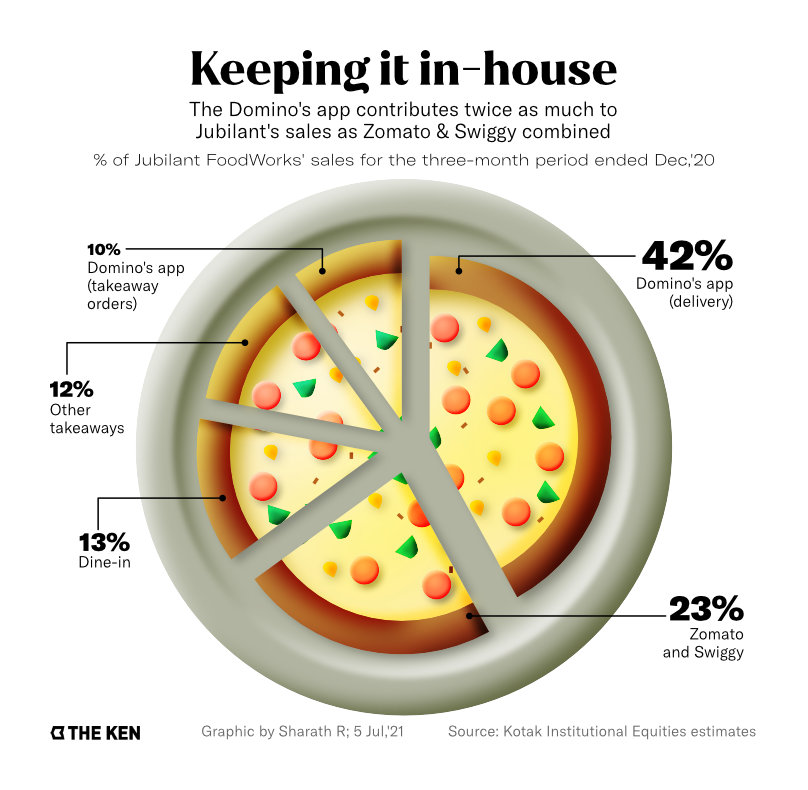
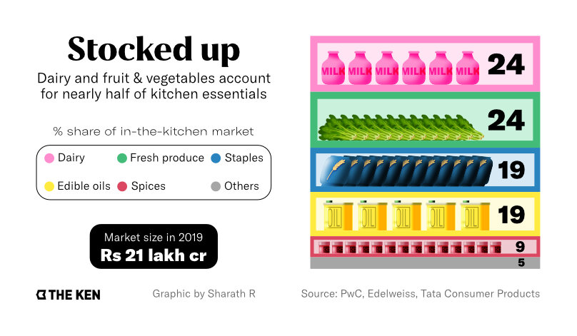
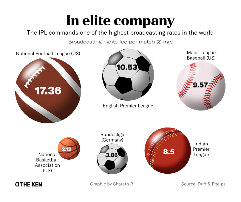
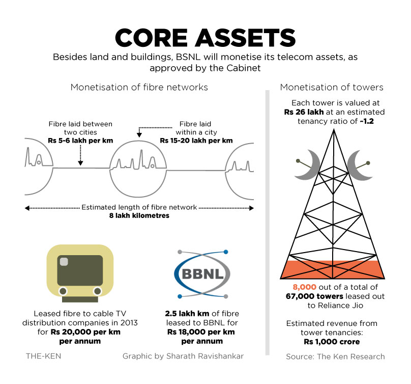
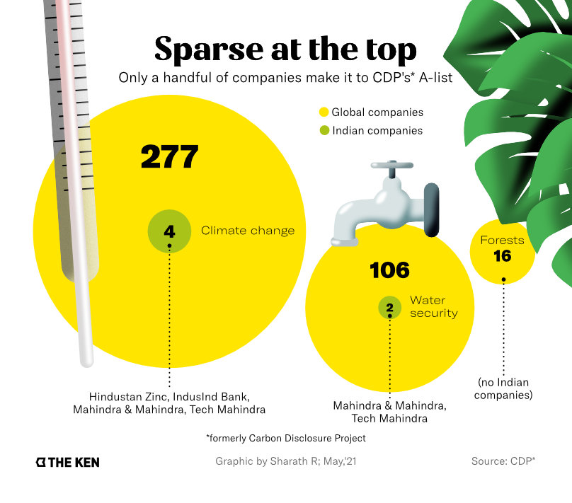
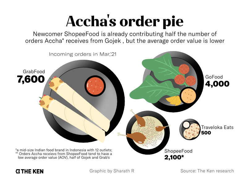
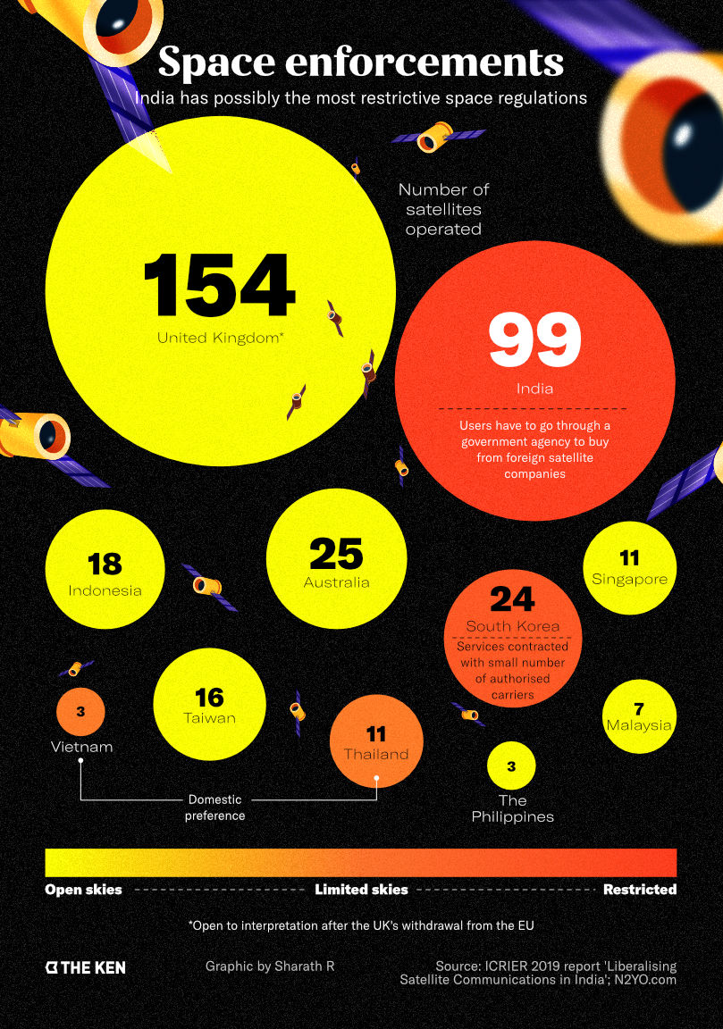
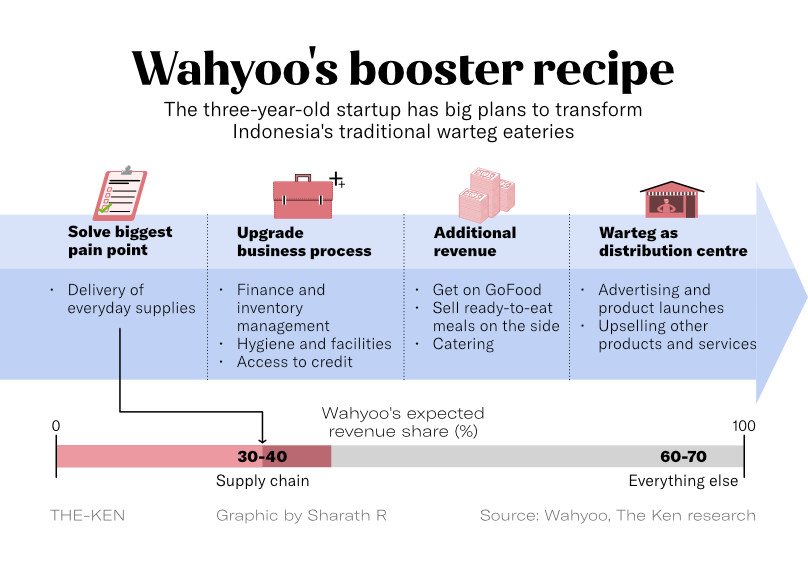
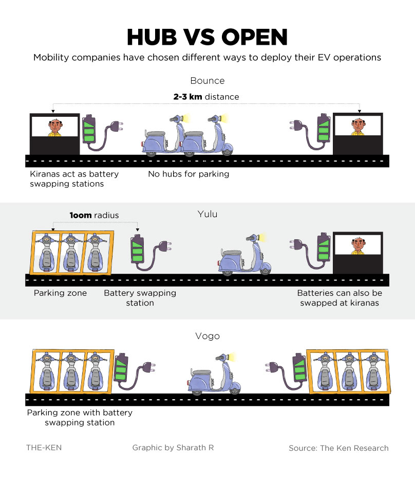
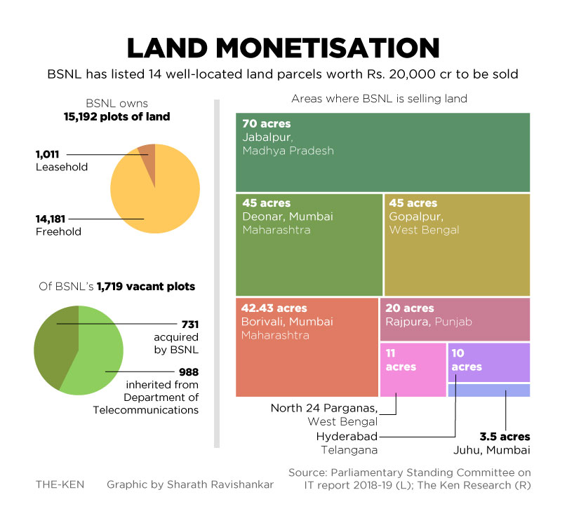
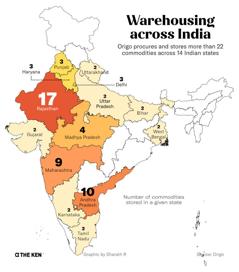
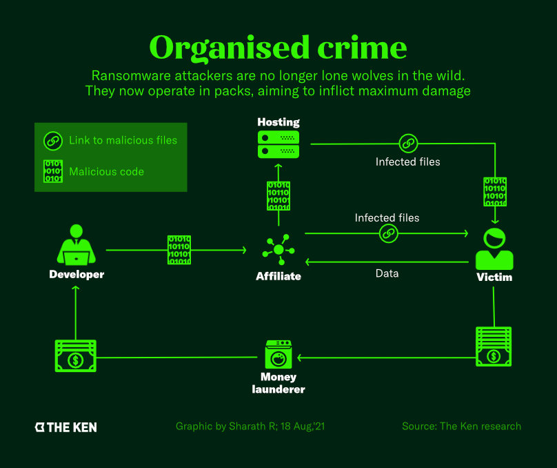
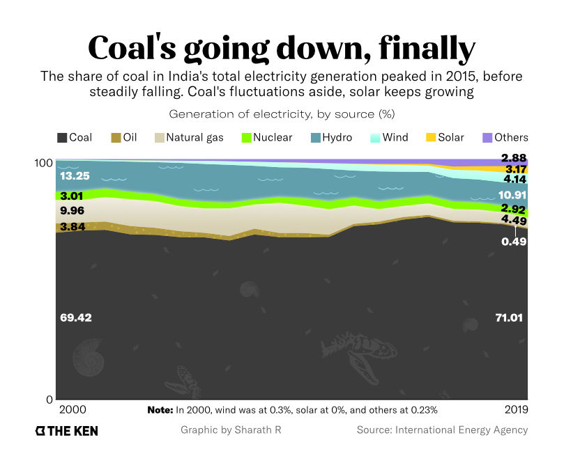
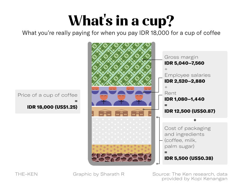
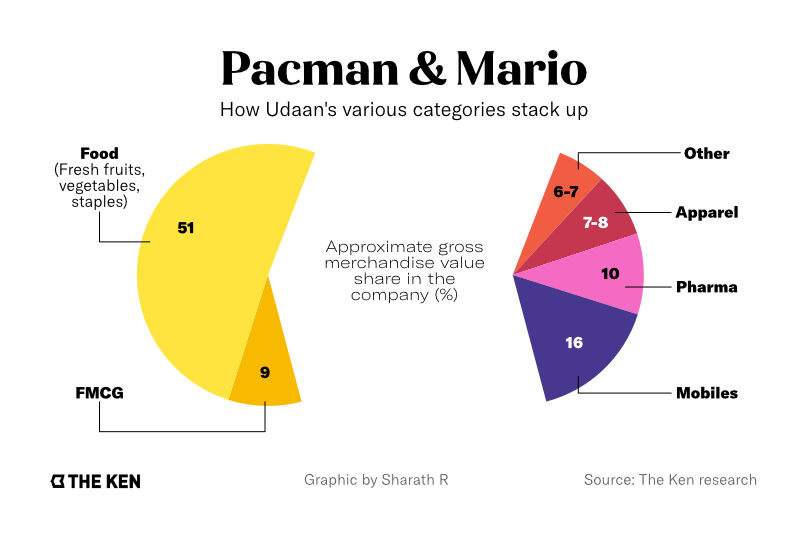
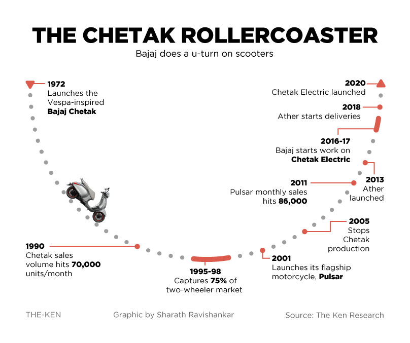
Below are a few of my favourite attempts at answering this question.